Combining advertising and art

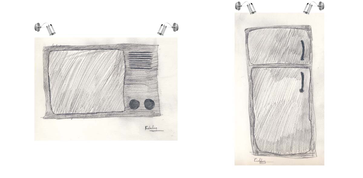
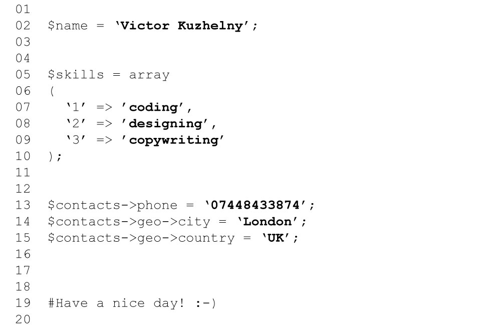
Is it possible? Of course it is! Honey Badger was a bit artish already (when we painted the wall for DAZ), so one more example about our artish nature… I’ve drawn it at 4 am the night before…

It is our protest against fridge-and-television-based society.


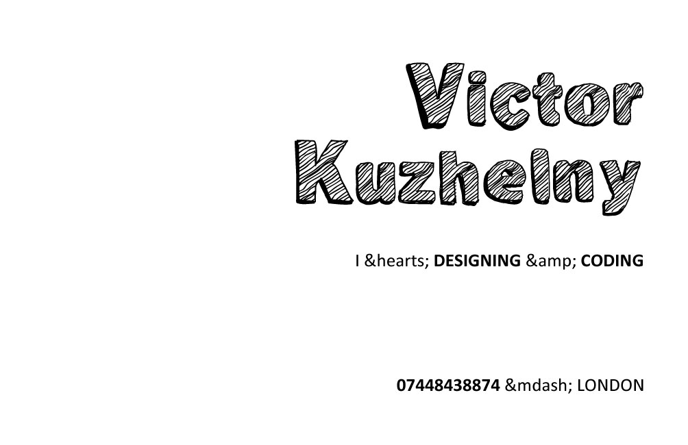
Business Cards

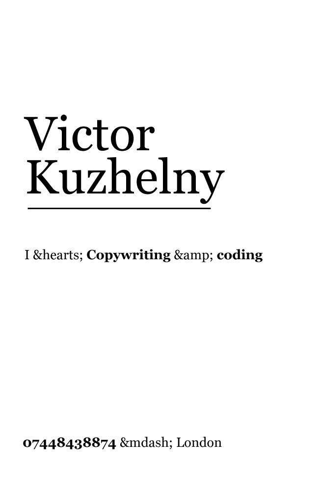
The task was to make 3 business cards in monochrome colour scheme and without any images. I made them black and white.


Tate Modern

Location matters. Our afternoon class has been held in Tate Modern. When you change location, you change your emotions and perception.

The bad thing was that the performance, Bruno planned to show us, had finished just a day before. It is a pity, but we still had a good time enjoying other performances by Sung Hwan Kim, Lis Rhodes, Suzanne Lacy.

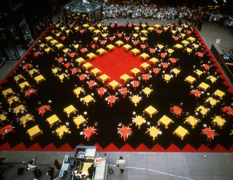
Suzanne Lacy’s work was a true example of transmedia storytelling: two stories of one carpet.


Benetton history

Today we studied the history of Benetton. This company became famous for its unconventional and a bit rebellious advertising style; all these ads were made by Olivero Toscani, who was working for Benetton from 1982 till 2000.

By the way, Benetton was called Maglierie Benetton, then it became just Benetton and, finally, they’ve turned their slogan to their brand: United Colors of Benetton.

Two piano ads

Vishua asked to write a feedback on our visit to the museum of brands, focusing especially on how advertising has been changing.

I wrote about two piano ads, first one was executed in the middle of 19th century, and another one just 20 years later.
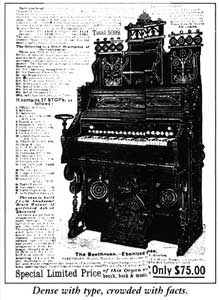
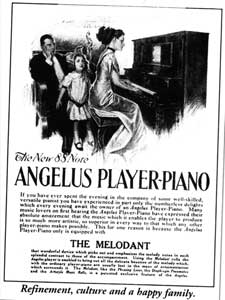
 

First ad sells piano with all of its technical details and another one already sells you a style of living, emotions. The main image here is not an image of piano (as in previous ad, which occupies 65-70%), but the image of happy family listening their mum playing.

Dramatic change in just 20 years.
Typography

Typography is all about readability and legibility. While working as a webdesigner, I’ve studied much about this: When your customer asks you to put red Comic Sans MS letters on black background, you need to prove your words with some theoretical studies.

I always fight for using simple readable fonts, black letters on white background.

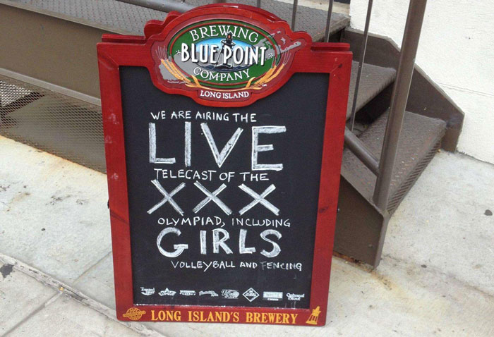
Many people don’t feel the borders of readability and non-readability, so that is the reason why we see so many examples of awful and ureadable ads.

A nice example of rubish

Justin for males

We agreed that it is much better to use my ads (with beer, condoms and pills) to advertise  Justin to his current fans (or people who already know him and like him).

When they’ll see the things that are not currently associated with Bieber, they would (we hope so) switch their brain on, experience some remarkable emotions and discuss this ads with friends, what is good to remember an ad.

Compelling brands

Every brand needs at least one thing from this list:

  • Brand Story (e.g. Mont Blanc, Meisterstuck)
  • Discovery / Entrerpreneural spirit / Belief (e.g. Innocent)
  • Engagement (e.g. The Economist)
  • Non-conventional (e.g. The Lung Association, VW Beetle – Lemon Ad)
  • Product quality (e.g. Holland & Holland, Waitrose)
  • Feedback to parent brand (e.g. Duracell energy drink, Virgin)